Choosing the right paint color for a room is about more than just personal taste—it’s about setting the tone, mood, and function of the space. The psychology of color plays a powerful role in how we feel in our homes, influencing everything from energy levels to relaxation, creativity, and focus.
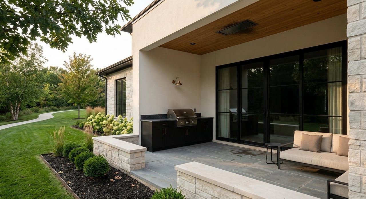
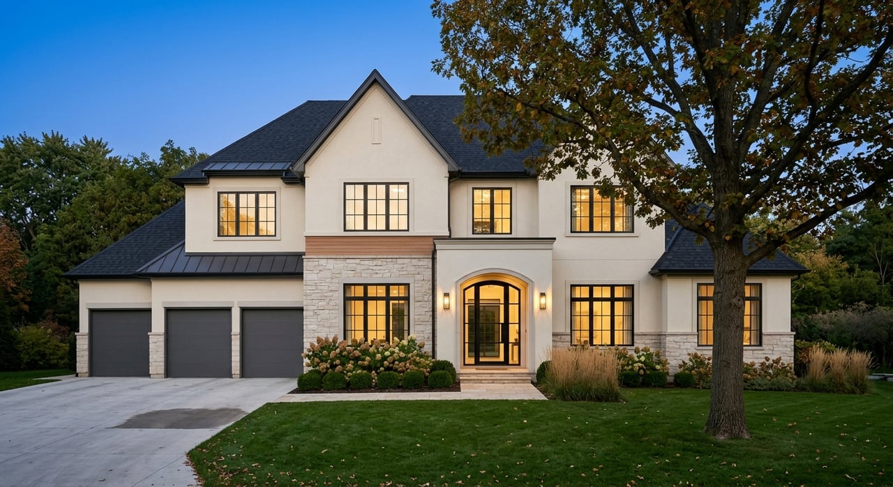
At Megan Mitchum + CO, we understand how design choices, especially color, impact the way people experience a home. Whether updating a single room or planning a full-home refresh in Des Moines, Iowa, these science-backed insights and practical tips will help you select paint tones that enhance your lifestyle and elevate your space.
Understanding the Psychology of Color
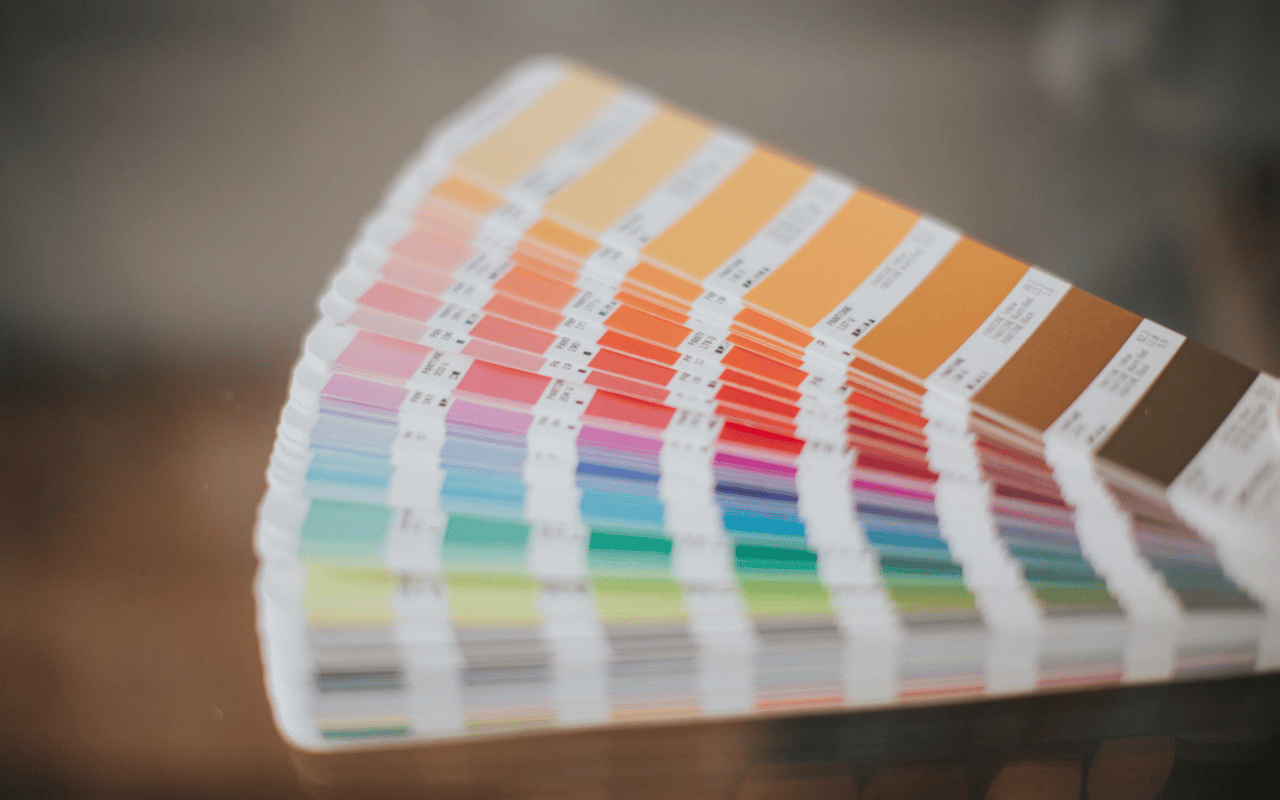
Color psychology is the study of how different hues affect human behavior, emotion, and perception. Each color evokes a different emotional response, and understanding this can help you design rooms with intention.
Here are some common interpretations of basic color families:
Here are some common interpretations of basic color families:
-
Blue: Often associated with calm, serenity, and productivity, blue tones are ideal for bedrooms, bathrooms, and home offices.
-
Green: Symbolizing nature, renewal, and balance, green works well in living rooms, kitchens, and spaces where relaxation is key.
-
Yellow: Bright and cheerful, yellow can spark optimism and energy, making it a good choice for kitchens, breakfast nooks, or laundry rooms.
-
Red: A stimulating and passionate color, red can raise energy levels. It’s best used in dining rooms or social areas where you want to encourage conversation and liveliness.
-
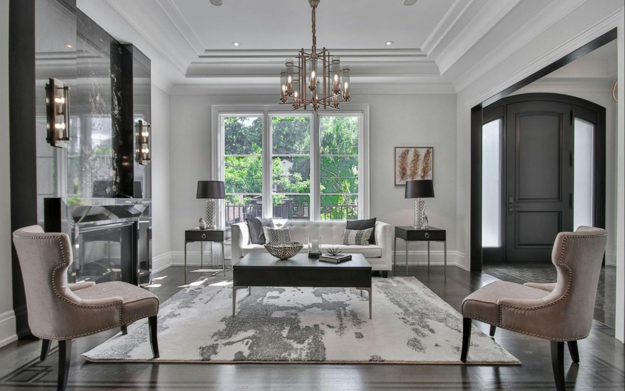
Gray: A modern neutral, gray promotes sophistication and calm. It’s extremely versatile and works well in almost any room.
-
White: Clean and airy, white tones promote simplicity and openness. They can make small spaces feel larger but need the right undertones to avoid feeling sterile.
-
Purple: Associated with luxury, creativity, and depth, purples can create dramatic or soothing effects depending on the shade.
1. Start with the Purpose of the Room
Before selecting a paint color, consider how the room will be used and what atmosphere you want to create. For example, a bedroom should feel restful and serene, while a dining room might aim to energize and encourage socialization. Aim for colors that feel welcoming and flexible for high-traffic areas like kitchens or living rooms. Use color to reinforce the room's function and evoke the right mood.
2. Factor in Natural and Artificial Lighting
Light dramatically affects how paint colors look in a space. Natural light changes throughout the day and can alter the appearance of a hue. A soft gray might appear cool in the morning, but take on warm undertones in the evening. Artificial lighting also plays a role—warm light bulbs enhance reds and yellows, while cooler bulbs bring out blues and greens. Before committing, test paint samples on multiple walls and observe them at different times of the day.
3. Use Undertones to Create Cohesion
Every paint color has an undertone—whether warm (red, orange, yellow) or cool (blue, green, violet). Matching undertones across rooms helps create a sense of flow throughout the home. For example, if your primary color palette leans warm, choosing a cool gray in one room might feel jarring unless balanced with complementary decor. Even whites and neutrals have undertones that affect how they interact with other elements in your home. Stick with a consistent undertone family for a harmonious feel.
4. Consider the Room’s Size and Architecture
Color can visually alter a room’s proportions. Lighter tones tend to make rooms feel larger and more open, while darker shades create a cozy, intimate effect. If you want to expand the feel of a small room, opt for soft neutrals or pale hues. On the other hand, darker or saturated colors work beautifully in larger rooms or in spaces with architectural interest like crown molding or wainscoting. Accentuating these features with color can enhance the home’s character and style.
5. Don’t Forget the Ceiling and Trim
Paint isn't just for walls. The ceiling and trim can contribute to a room’s overall look and feel. A white ceiling is a classic choice that enhances height and light, but in some cases, painting the ceiling a soft variation of the wall color can create a more unified or dramatic effect. Likewise, trim and molding can pop in a crisp contrasting shade or blend in for a more seamless appearance. Make these decisions part of your overall color plan rather than an afterthought.
6. Create a Whole-Home Palette
To maintain consistency, especially in open-concept homes, it’s helpful to create a whole-home color palette of 3–5 complementary hues. This doesn’t mean every room must be painted the same color, but rather that each tone should coordinate with others to ensure a cohesive flow. Use variations of one main color or stick to a certain saturation level to tie rooms together. For example, a muted green in the living room can transition into a soft beige in the dining area, and a deeper forest green accent in the den.
7. Use Bold Colors Intentionally
Bold colors can be incredibly impactful when used strategically. Consider a vibrant accent wall in a home office, a deep navy in a powder room, or a jewel-toned door to add personality. The key is balance. Pair strong colors with neutral elements to prevent them from overwhelming the space. Accessories, furniture, and textiles can reinforce or soften the bold color depending on the desired effect. If you're hesitant to commit to a bold wall, test it in a smaller space first or use it as an accent in artwork or decor.
8. Leverage Color to Enhance Market Appeal
If you're renovating with the intention to sell, color choice becomes even more critical. Neutral palettes with broad appeal are generally preferred, helping potential buyers envision their own style in the space. Soft grays, beiges, and whites remain popular for resale. But adding subtle color in the right areas—like a navy island in a white kitchen or sage green cabinets in a bathroom—can make your home feel fresh and inviting without alienating buyers. At Megan Mitchum + CO, we offer tailored advice to ensure your color choices resonate with the Des Moines buyer market.
9. Test Before You Commit
Paint swatches on a wall look different than they do in a can or on a color card. Always test a few options in each room you plan to paint. Apply large swatches directly to the wall and observe them in different lighting conditions for at least 24–48 hours. Paint can dry darker or lighter than expected, and what works in one space might not work in another due to lighting, flooring, and other fixed elements. Taking the time to test can save you from costly repainting later.
Need Help Making Your Home Color-Perfect? Let’s Talk
The right paint color has the power to transform your space, influence your mood, and even boost your home’s value. Whether you're updating one room or creating a cohesive look across your entire property, thoughtful color choices make all the difference. At Megan Mitchum + CO, we’re more than just real estate experts—we’re design-savvy professionals who can help you create a home that feels as good as it looks.
Let us guide you through every shade, tone, and finish. Whether you're exploring design options or planning a new home in the West Des Moines real estate market, contact us today and let’s bring your vision to life.